
Liverpool restaurant website design: fewer taps to a table
Someone finds a Liverpool restaurant on Google while they are out, hungry, late, or trying to settle an argument about where to eat. They open the site on their phone looking for four things: the menu, the location, opening times and a way to book or order.
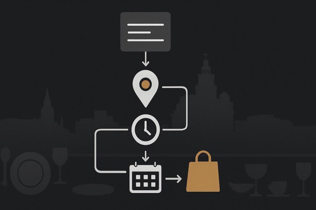
Instead, plenty of restaurant sites greet them with a full-screen photograph, an animated logo and a fair bit of scrolling. The food may look excellent. The customer is still no closer to knowing whether the kitchen is open.
Good website design for restaurants in Liverpool puts high-intent information where diners can find it quickly on a phone. The website should provide a clear route from search result to menu, practical details, trust signals and booking, enquiry or ordering action. Photography and brand character matter, but they should support that route rather than obscure it.
The restaurant journey checklist
Work through this in the same order a customer does. It is more useful than arguing about whether the homepage needs another slow video background.
| Customer moment | What they need | Website check |
|---|---|---|
| They find you in search | A clear reason to open the site | Page title, summary and imagery match the restaurant and location. |
| They land on mobile | Immediate direction | Menu, book, order and find us actions are visible without a hunt. |
| They check the menu | Readable food, drinks and dietary information | The menu loads quickly and works properly on a small screen. |
| They make a practical decision | Opening times, address and travel details | Details are current, prominent and easy to act on. |
| They decide whether to trust you | A sense of the place and what to expect | Photography, reviews, awards or press mentions are relevant and restrained. |
| They are ready to act | A booking, enquiry or order route | The action is clear, works on mobile and does not send them in circles. |
1. Put the menu where hungry people expect it
The menu is often the main reason a visitor has opened the site. It should be a prominent navigation item and usually a visible mobile action near the top of the page.
A PDF can be acceptable if it is simple, current and readable on a phone. It is less helpful when it is a scan of an old printed menu, takes ages to load on mobile data, or opens sideways at a size that requires pinching and squinting. A proper HTML menu is generally easier to browse, update and link to, especially where dietary information changes regularly.
- Make food and drinks easy to distinguish.
- Include prices where that suits the restaurant’s model.
- Keep dietary markers clear, but do not rely on colour alone.
- Check that seasonal menu links do not still lead to last Christmas.
- Give each menu page a sensible page title for people arriving directly from search.
2. Make location and opening information hard to miss
A Liverpool diner may be checking whether you are close to where they are, whether parking is realistic, or whether the kitchen is still serving. Put the address, opening times and a map route in obvious places, not only in a footer that looks like it has been added under duress.
Be precise about split service times where relevant. If lunch ends at 3pm but drinks continue, say so. If the kitchen closes before the venue does, say that too. Small ambiguities create unnecessary calls and disappointed walk-ins.
For restaurants developing a fuller hospitality presence across more than one venue or market, the wider considerations are covered in this hospitality website design approach. The immediate restaurant journey still comes first.
3. Choose the right next action for the restaurant
Not every restaurant needs online ordering. A destination restaurant, small chef-led venue or restaurant focused on table bookings may need a booking route and a phone number far more than a checkout system. A takeaway-led venue may need ordering to be much more prominent.
Design the restaurant site around the next customer action, not around showing every brand asset. That means deciding what a visitor should do after reading the menu, then making that option consistent across the website.
- Table bookings: use a visible button leading to the correct booking platform or booking form.
- Phone enquiries: make the number tappable and check it is the current number.
- Private dining or events: provide a separate enquiry route with useful starting details.
- Takeaway or delivery: link clearly to the relevant ordering route, if it is part of the business.
A familiar operational mistake is treating a booking confirmation screen as proof that the restaurant has received everything correctly. Test the full route. Make a booking enquiry, check the confirmation email arrives in the right inbox, and make sure it has not landed in an old mailbox or a spam folder because SMTP settings were never properly sorted.
4. Use photography to answer questions, not delay answers
Strong photography matters in hospitality. It helps customers judge atmosphere, food style, occasion and price point before committing. But it should not make the site lumber along or bury the useful bits.
Use a few well-chosen images that show the room, dishes, bar or service style. Compress them properly, serve sensible image sizes and check the mobile version. A homepage hero image that is lovely on a studio connection but slow on a phone outside Lime Street is doing the restaurant no favours.
For examples of considered business websites and visual direction, you can review recent Standish Services website work. The aim is not to copy another venue’s look. It is to see how structure and presentation can work together.
5. Give visitors enough proof to choose you
Restaurant decisions are often quick, but they are still trust decisions. Visitors want a feel for what sort of place they are booking. A concise about section, chef or team context, press mentions, relevant reviews, awards, accessibility details and useful policies can all help.
Keep it believable. A restaurant with a relaxed neighbourhood offer does not need to sound like a luxury resort. Clear, current information tends to do more work than a page of grand claims.
6. Run a phone test before redesigning everything
Open the site on a phone without relying on your own memory of where things live. Imagine you have just searched for dinner in Liverpool and have ten minutes to decide.
- Can you reach the menu in one or two taps?
- Can you see whether the restaurant is open?
- Can you get directions without copying an address?
- Can you book, call, enquire or order from the menu page?
- Does the main action remain visible after a bit of scrolling?
- Does every external booking or ordering link go to the right destination?
If the answer is no to several of those, start with the journey rather than commissioning a decorative rebuild. A focused Liverpool website design review can help identify whether the issue is page structure, mobile layout, slow media, outdated content or a booking route that has simply drifted out of date.
What should a restaurant website include?
A restaurant website should include a current menu, location, opening information, contact details and a clear route to the action that matters most, such as booking, calling, private dining enquiry or ordering. It should also provide enough photography and context for customers to understand the venue. The priority is making those essentials quick to find on mobile.
Is online booking essential for every restaurant?
No. Online booking is useful where table reservations are central to how the restaurant operates, but it is not compulsory for every venue. Some restaurants need a direct call route, walk-in information, private dining enquiries or a clear takeaway route instead. Choose the action that fits how customers actually buy from you, then make it obvious.
Email Standish Services to review your restaurant website and check whether a customer on their phone can find the menu and act within a few taps.