
AI agent website form usability: can it tell success?
The enquiry form accepts the submission. The button changes from dark grey to green. Nothing else appears.
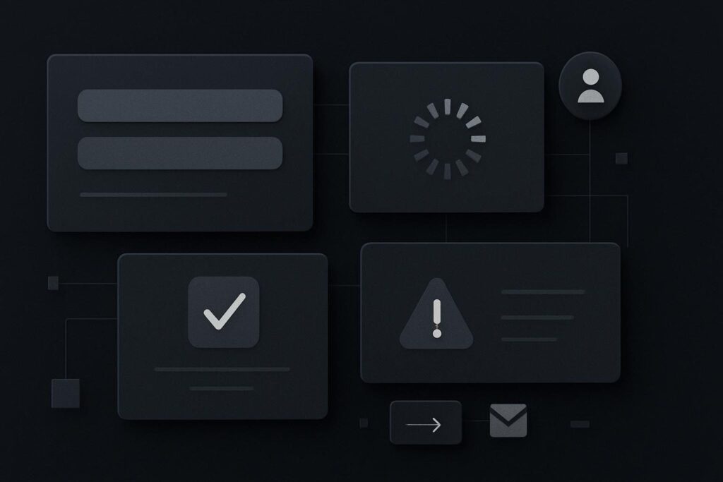
The person who submitted it is left wondering whether the message has gone through. An automated assistant assessing the interaction has the same problem, only without the benefit of intuition, patience or a spare browser tab. It can see that something changed. It cannot safely assume what that change means.
For a Dubai, UAE, Liverpool or UK service business, this is a fairly ordinary contact-form issue with a newer angle. AI agent website form usability is about whether a form makes its purpose, requirements, progress and outcome explicit enough to interpret without guesswork. You do not need to build a form for autonomous submission. You do need to make the route understandable.
A submitted form is not proof of a clear interaction
A form can work technically and still be vague operationally. This happens a lot with page-builder forms, especially where success feedback is set to a small animation, a button-colour change or a message that disappears before anyone has read it.
The old assumption is that if a human can muddle through, the form is fine. That is a low bar for something carrying sales enquiries, appointment requests or project briefs. A human may retry, phone the business or send a WhatsApp message. An automated system may simply be unable to establish whether the action completed.
Clear form states are also supported by accessibility practice. The W3C Web Content Accessibility Guidelines cover labels or instructions for inputs and programmatically determinable status messages, helping user agents and assistive technology identify input purpose, errors and changes after an action. It is sensible website work, rather than a speculative bet on one particular AI tool.
Run an enquiry-form state audit
Use one real enquiry form, preferably the one most likely to be used by a new prospect. Test it on a phone as well as a desktop. Do not only test the tidy successful route with every field completed correctly. The awkward routes are where unclear forms tend to show their hand.
| Form check | What should be explicit | Common weak version | Audit priority |
|---|---|---|---|
| Field label | A visible label explaining what belongs in the field | Placeholder text that vanishes once typing starts | High |
| Field purpose | Clear distinction between name, work email, phone and enquiry details | A field marked only as contact | High |
| Required state | Which fields are mandatory before submission | An asterisk with no explanation, or no indication at all | High |
| Validation error | Specific message beside or connected to the affected field | A red border with no useful reason | High |
| Submit button | An action-based label such as Send enquiry or Request a callback | Submit, Done or an arrow icon | Medium |
| Loading state | A visible indication that the form is processing and should not be sent twice | A frozen button that may look broken | Medium |
| Success state | Clear confirmation that the form was accepted, plus what happens next | Button colour changes with no message | High |
| Failure state | An explicit failure message and a route to continue contact | Form resets or displays a vague warning | High |
| Fallback route | Phone, email or another monitored contact method | No alternative if the form fails | High |
Test the states, not just the happy path
A useful agentic form test is simple. Open the form in a clean browser session and record what a cautious observer could establish at each stage. The point is not to imitate a named AI assistant or claim compatibility with one. It is to check whether the interface exposes enough evidence for any automated process, assistive technology or uncertain visitor to follow it safely.
- Read the form before entering anything. Can you identify its purpose and every required input without relying on placeholder text?
- Leave a required field blank and submit. Does the form name the missing field and explain what needs correcting?
- Enter an invalid email address. Is the error specific, visible and still present long enough to act on?
- Submit valid details once. Does the button show processing, preventing uncertainty and repeated clicks?
- Wait for the response. Is there an explicit success message that says the enquiry was received and explains the expected next step?
- Force or simulate a failure where practical. Does the form say it failed, retain entered details where possible, and offer another contact route?
A boring but useful detail: a success message only proves that the browser received a response from the form. It does not prove that the notification email reached the right inbox. A WordPress site may show a cheerful confirmation while SMTP settings are wrong, the destination address is an old staff inbox, or the message has wandered into spam. Test delivery separately, then keep the on-page confirmation honest.
The form needs to describe the action it is taking
Button labels matter more than they are usually given credit for. A button marked Send enquiry tells the visitor what action is being requested. A button marked Continue may make sense in a multi-step process, but only if the next state is clear. An icon-only button is asking people to interpret design rather than language.
Likewise, a success message should not merely say Thanks. A more useful version might state that the enquiry has been received, that a response is normally sent during business hours, and that the visitor can call or email if the matter is urgent. Keep it accurate. If nobody monitors the inbox at weekends, do not pretend otherwise.
Dynamic controls need extra scrutiny
Conditional fields, address lookups, calendar widgets, file uploads and multi-step forms can all be useful. They can also hide essential information behind a change that is visually obvious but poorly communicated.
Check whether a newly revealed field is announced clearly, whether an error persists after moving between steps, and whether the final confirmation remains available after submission. On mobile, watch for a keyboard covering the error message or a sticky cookie banner sitting over the submit button. These are the sort of small implementation details that can turn a perfectly respectable enquiry route into a guessing game.
If your forms rely heavily on JavaScript, include them in a wider JavaScript readiness audit for AI search bots. A form does not need to work without JavaScript in every setup, but its important states should not be hidden behind unexplained visual changes.
Give failure a proper route out
The specific bad version is familiar: an enquiry form accepts details, changes the button colour, then offers no confirmation and no fallback. The visitor may submit again. The business may receive duplicates. Or the visitor may assume they have been ignored and contact a competitor who made the next step less mysterious.
Put a monitored alternative route close to the form. It could be a phone number, a business email address or a clearly maintained WhatsApp option. The fallback is not an admission that the form is unreliable. It is a sensible escape hatch when a browser extension, poor connection, script conflict or delivery issue gets in the way.
For the wider journey beyond the form itself, review how an agentic browsing audit can trace a complete enquiry route. The form is only one part of the decision path, albeit a part with a habit of causing quiet failures.
Use the audit where enquiries matter most
Start with the contact form on your main service page, then work through booking forms, quote forms and any lead magnet that promises a follow-up. Capture screenshots of each state and note what the visitor can actually know, rather than what the developer intended the interaction to mean.
If the result exposes wider issues with structure, accessibility, scripts or unclear calls to action, a broader AI readiness audit for your website can put the form findings in context.
Ask Standish Services to review whether your form states are explicit enough. Make the form state explicit enough that neither a person nor an automated assistant has to guess what happened.
Questions about AI agent website form usability
What makes a website form easier for AI agents to understand?
Visible labels, clearly marked required fields, specific validation messages, action-based buttons, understandable loading states and explicit success or failure messages all reduce ambiguity. The same features generally help people, screen-reader users and support teams understand the interaction. The aim is clear evidence of what the form needs and what happened after submission.
Why do explicit success and error states matter?
They prevent uncertainty after an action. Without an explicit success message, a visitor may submit twice or abandon the enquiry. Without a useful error message, they may not know which field needs fixing. A clear state also helps automated systems and assistive technology identify whether the process completed, failed or needs further input.