
WooCommerce web design Liverpool: follow the sale
The product page looks great. Clean photography, smart product cards, a decent colour palette, all the bits everyone can see in a design review.
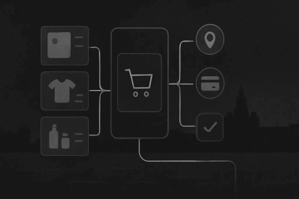
Then a customer on a phone chooses a size, misses the tiny variation prompt, reaches the basket and cannot work out whether delivery has been calculated. By the time they reach checkout, the visual work has run out and the actual buying work has begun.
That is where plenty of WooCommerce redesigns go a bit sideways. A Liverpool retailer might approve the new product grid without realising that mobile variation errors, delivery choices and cart feedback have barely been discussed. The expensive problems often live in the gaps between templates, rather than inside one handsome page.
A WooCommerce redesign needs a route, not a set of screens
WooCommerce web design in Liverpool should plan the full route from product discovery to post-purchase follow-up. That means deciding how customers find products, compare options, select variations, understand stock and delivery, correct mistakes, pay, receive confirmation and return later. Design makes those moments understandable; development makes the data, rules and behaviour work properly.
A good-looking product page matters, obviously. It is not the main measure of ecommerce design. If the purchase route is unclear at the moments where somebody has to make a decision, the polished bits are doing a lot of heavy lifting for no good reason.
For broader help joining those decisions to the templates, product data and custom behaviour behind them, see our WooCommerce development support for Liverpool stores.
Follow one order from first look to confirmation
Take a retailer selling clothing, homeware or made-to-order goods across Liverpool and the wider UK. A customer arrives from search, a social post or a repeat visit. Their route is rarely as neat as a wireframe makes it look.
| Buying stage | Design decision | Development requirement |
|---|---|---|
| Category discovery | Make product groups, filters and search routes easy to scan | Configure taxonomy, filters, search behaviour and product attributes |
| Product choice | Show options, price changes, availability and guidance at the point of choice | Handle variations, stock rules, conditional fields and product data |
| Basket review | Confirm what was added and make edits obvious | Update basket totals, notices, coupon rules and shipping calculations correctly |
| Delivery and checkout | Explain delivery choices, payment steps and errors without clutter | Connect shipping zones, gateways, address logic and validation states |
| Order follow-up | Set clear expectations after payment | Trigger order emails, account actions, stock updates and integrations |
1. Discovery should narrow the choice without hiding the stock
Category pages are not merely a shelf of product cards. Customers need to understand what they are looking at, whether an item is available and how to reduce a large range without clicking through twenty near-identical options.
The design question is whether filters, sorting and search are visible enough to help. The development question is whether the product attributes are structured consistently enough for those controls to return useful results. A filter called material is not much use if half the products have material entered as free text and the other half do not.
2. Product pages need to deal with hesitation
On a product page, the customer may need to choose a size, colour, pack quantity, delivery date or add-on. Each choice can affect price, availability and the ability to add the item to the basket.
Make required choices visible before the add-to-cart button, and make errors specific. A vague red message at the top of a long mobile page is technically an error state, but it is not especially helpful. The shopper should see what is missing, where to fix it and what changes when they do.
That may require standard WooCommerce configuration, a variation swatch extension or custom development. The right answer depends on the products and rules, not on whichever plugin has the flashiest demo.
3. The basket has to answer the awkward questions
After adding an item, customers want reassurance that the right variation, quantity and price have made it into the basket. They also want to know what delivery will cost and whether a promotion has applied before they commit to payment.
This is where small technical details earn their keep. Shipping methods may depend on postcode, basket value, product class or collection status. A delivery estimate that appears only after several taps on mobile creates uncertainty at exactly the wrong time.
Test this with realistic addresses, mixed baskets and discounted products. Also check what happens after an update: a cached basket fragment or a payment extension update during business hours can make an otherwise tidy redesign behave oddly for live customers.
4. Checkout must keep the customer moving
Checkout design is mainly about reducing ambiguity. Ask for what is needed, explain unexpected fields, show errors beside the relevant input and avoid pushing the customer into a dead end after a failed payment.
Mobile deserves its own review. Do delivery options fit the screen? Does the keyboard obscure the payment fields? Can someone recover from an invalid postcode without having to start again? Does the payment provider return them to a useful order state?
If you are deciding who should own these moving parts, our guide on choosing WooCommerce developers by following one order is a useful way to assess the work beyond a homepage mock-up.
5. Confirmation is part of the purchase, not an afterthought
A paid order needs a clear confirmation screen and an email that gives the customer a sensible next step. For account-based stores, that might mean access to order history, downloads, returns information or a way to repeat a purchase.
Check the email route as well as the screen. WooCommerce can display a successful order while the confirmation email has been held by an old SMTP setup, sent from the wrong address or dropped into a spam folder. The order is still real, but the customer experience is poorer than it needs to be.
Use a journey map before approving visual direction
Before signing off designs, map one normal order and a few awkward ones. Include a first-time mobile buyer, a customer changing a variation, a basket that qualifies for a delivery threshold, a declined payment and an order requiring a clear follow-up message.
- List every page, overlay, email and third-party handoff in the route.
- Write down what the customer needs to know or decide at each point.
- Separate what needs design treatment from what needs product data, configuration or custom code.
- Test the route on a real phone before treating the build as complete.
This is not an argument against visual design. It is an argument for giving visual design a job to do. Design the transaction as one connected journey, not a collection of isolated screens.
Once the store is live, planned checks still matter. Our notes on WooCommerce checkout maintenance for Liverpool businesses cover why controlled test orders are worth making part of the routine.
Questions about WooCommerce web design
Which WooCommerce pages need custom design?
Usually the pages that carry buying decisions need the closest attention: category pages, search results, product pages, basket, checkout, account areas and order confirmation. They do not all need elaborate bespoke layouts. They do need clear states for stock, variations, delivery, errors, payment and post-purchase actions.
What should be tested on mobile before launch?
Test search, filtering, product variations, add-to-cart feedback, basket edits, coupon behaviour, delivery selection, address validation, payment return routes and confirmation emails. Use an actual device where possible. A desktop browser resized to a narrow width is useful, but it does not reproduce keyboard behaviour, touch targets or mobile payment steps.
When does WooCommerce design require custom development?
Custom development is worth considering when the store has rules standard settings cannot express cleanly, such as product-specific delivery logic, complex bundles, tailored account actions, trade pricing or unusual variation behaviour. Start by defining the customer need and business rule. Then decide whether configuration, a well-supported extension or custom code is the sensible route.
Email Standish Services to scope the complete buying journey before approving the visual direction.